
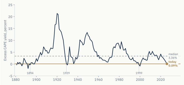
Take the cyclically adjusted price-to-earnings ratio for large US companies, which is 40.4 today. Turn it upside down and you get an earnings yield of 2.48 percent. Then take the yield on a ten-year inflation-protected Treasury, which is 2.39 percent. The difference is 0.09 percent. Robert Shiller calls this the excess CAPE yield, and it answers a simple question: how much extra is an investor paid for owning shares rather than a bond that guarantees purchasing power? The long-run answer is 3.36 percent. Today it is nine basis points.
That is the opening measurement of this piece, not its conclusion. The title is not a forecast that markets will fall. It is a description of where an allocator can currently go. Shares are expensive almost everywhere. The cheap markets that show up on a screen turn out to be indices of three or ten companies. Gold, the traditional answer to all of this, has never been more expensive relative to the world’s money. And the government bonds most portfolios hold to offset equity risk only work in one of the two ways this can plausibly end.
Each of those is somewhere an allocator would normally go when the first one gets expensive, and each is compromised. This piece works through them in turn, and ends with the only asset we can find whose price is not being set by whatever set the price of the others. Figures are as at 25 August 2026 unless stated otherwise. Equity valuation figures are as at 13 August 2026.
| Measurement | Reading |
|---|---|
| Excess CAPE yield, US large caps | 0.09% against a 3.36% long-run average |
| US large-cap valuation percentile | 99th, against its own history since 1880 |
| Gold against broad money | 39.1, against a 17.7 thirty-year median |
| Bitcoin from its October 2025 high | −36.4% |
The premium is gone
US equities pay nine basis points over inflation-linked bonds. Shares are expensive almost everywhere, and the cheap markets that show up on a screen turn out to be indices of three or ten companies.
Nine basis points
Of 1,725 months since 1881, only 126 have been at or below where the excess CAPE yield is now. They fall in the 1880s and 1890s, around 1929 and 1936, and in 1999 and 2000.
Figure 1. The premium for owning equities. The excess CAPE yield from 1881, annual averages of Shiller’s monthly series carried to today’s reading of 0.09 percent, shaded where the premium was at or below today’s level.
| Excess CAPE yield | Value |
|---|---|
| Today | 0.09% |
| Long-run average since 1881 | 3.36% |
| Months at or below today’s level | 126 of 1,725 |
| Buyback-corrected version (total-return CAPE) | −0.09%, 16th percentile |
Companies return cash through buybacks now rather than dividends, so you might ask whether a yield measure still means anything. It does here, because this one is built from earnings rather than payouts, and earnings are counted before the company decides what to do with them. There is a smaller effect, since buybacks shrink the share count and flatter earnings per share, and Shiller built a version of CAPE that corrects for it. On that version the premium is minus 0.09 percent instead of plus 0.09, and the ranking moves from the 7th percentile to the 16th. Same answer, different decimal. The working is in the appendix.
It is not only the US
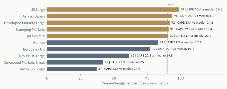
Every index a large institution is likely to own sits high in its own history. Not against some theoretical fair value, but against what that same index has traded at before.
Figure 2. Valuation percentile of each index against its own history. Gold marks the 90th percentile and above.
| Index | CAPE today | Median | Percentile | Data from |
|---|---|---|---|---|
| US Large | 40.4 | 16.6 | 99th | 1880 |
| Asia ex Japan | 25.0 | 16.7 | 94th | 1999 |
| Developed Markets Large | 33.4 | 24.3 | 92nd | 1987 |
| Emerging Markets | 22.9 | 15.5 | 91st | 2001 |
| All Country | 31.7 | 23.2 | 91st | 1987 |
| Europe | 21.3 | 17.3 | 83rd | 1979 |
| Developed Markets Small | 24.9 | 25.3 | 42nd | 2012 |
Set today against the whole range each index has ever traded across and it is clearer. Several are not merely above their medians. They are close to the highest they have ever been.
Figure 3. Each index against its own full history. The grey bar is the interquartile range, the navy tick the median, the gold dot today.
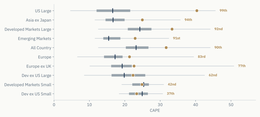
Emerging markets deserve a mention, because that is where allocators have traditionally gone to escape an expensive America. That route is closed. The index sits at its 91st percentile, and the reason is what is inside it. Taiwan and South Korea are both at their 99th percentiles and now dominate it through the AI supply chain.
What a cheap market actually contains
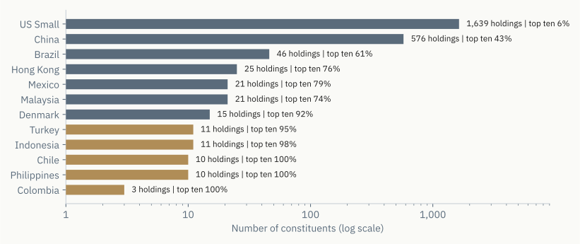
Cheap markets do exist. Indonesia trades at its 1st percentile, Turkey at its 16th, the Philippines at its 19th, Chile and Colombia at their 30th. The problem is not that you cannot buy them. Funds exist for most of them. The problem is what is inside the fund.
MSCI Colombia holds three companies, and 80 percent of it is banks. MSCI Philippines holds ten, and those ten are the entire index. Chile is the same. Indonesia holds eleven, two thirds of it financials. Turkey holds eleven. For comparison, MSCI Japan holds 168 companies and its largest ten come to 30 percent.
Figure 4. Number of constituents by index, log scale. Gold marks indices holding twelve companies or fewer.
| Market | CAPE percentile | Constituents | Top-10 weight | Largest sector |
|---|---|---|---|---|
| Indonesia | 1st | 11 | 98% | Financials, 66% |
| Turkey | 16th | 11 | 95% | Industrials, 33% |
| Philippines | 19th | 10 | 100% | Industrials, 53% |
| Brazil | 23rd | 46 | 61% | Financials, 40% |
| Chile | 30th | 10 | 100% | Financials, 38% |
| Colombia | 30th | 3 | 100% | Financials, 80% |
| US Small (comparison) | 28th | 1,639 | 6% | Industrials, 19% |
A valuation ratio for a market of three companies tells you about three companies. It does not tell you about Colombia. The cheapness is arithmetically real and close to useless in a portfolio, because what you would be buying is a concentrated bet on a few names in one sector.
Liquidity says the same. The funds tracking the Philippines, Turkey and Indonesia trade about 32 million dollars a day between them. The biggest S&P 500 tracker does that in twenty seconds. Brazil is the exception, with 46 companies and 720 million dollars a day, and it is the only one on the list you could buy at size.
Cheap money is not the explanation
The usual explanation for expensive markets is cheap money. That is not available here, and the earnings carry costs that have not reached the accounts yet.
Rates are high, not low
The real ten-year Treasury yield is 2.38 percent, the 95th percentile since inflation-protected bonds began trading in 2003. Real rates are near the highest they have been this century. The nominal ten-year at 4.70 percent only looks ordinary because the 1970s drag the long-run average up.
Figure 5. Ten-year Treasury yields since 2003. Annual averages, with the final point of each line the latest reading. The real yield is near its highest of the century.
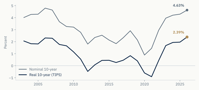
| Year | Real 10-year (TIPS), annual avg | Nominal 10-year, annual avg |
|---|---|---|
| 2003 | 2.06% | 4.01% |
| 2008 | 1.77% | 3.66% |
| 2012 | −0.48% | 1.80% |
| 2020 | −0.60% | 0.89% |
| 2023 | 1.68% | 3.96% |
| Latest reading | 2.38% | 4.70% |
Expensive markets alongside high real rates is worse than expensive markets alongside low ones. The premium has been squeezed from both ends at once.
What is loose is not the price of money but the supply of it. The Chicago Fed’s financial conditions index is at minus 0.57, easier than roughly two thirds of the past fifty-five years. Credit is available and spreads are near their tightest. What is driving prices is appetite for risk in easy conditions, which behaves differently from cheap money when it turns.
Costs that have not reached the accounts yet
There is also a question about the earnings themselves. CAPE divides price by ten years of averaged earnings, and accounting counts a cost when it is incurred. A promise to spend money later sits in a footnote and does not reduce today’s earnings.
Those footnotes have grown. The Wall Street Journal went through the latest filings of nine large technology companies on 16 August and found roughly three trillion dollars of commitments that are not on their balance sheets, most of it related to AI. About 1.9 trillion is purchase obligations and 1.2 trillion is leases that have not started, the latter around four times what it was a year ago. The same companies spent about 600 billion on capital expenditure over the year, and their combined balance-sheet leases and long-term debt come to a little over 600 billion.
Alphabet shows the pace. Its purchase commitments were 811 billion dollars at the end of June against 332 billion three months earlier. It did not explain why. Some of its energy contracts run to 2054.
Figure 6. Commitments on and off the balance sheet. Alphabet, Amazon, Meta and Microsoft. Gold marks the commitments that sit off the balance sheet.
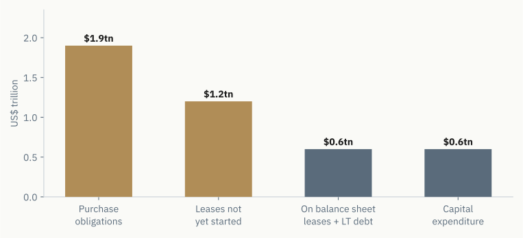
| Category | Amount | On balance sheet? |
|---|---|---|
| Purchase obligations | $1.9 trillion | No |
| Leases not yet started | $1.2 trillion | No |
| Balance-sheet leases and long-term debt | $0.6 trillion | Yes |
| Capital expenditure, trailing year | $0.6 trillion | Yes |
None of this is hidden. It is disclosed the way the rules require, and companies have always made purchase commitments. What is unusual is the size, the speed of growth, and the fact that these obligations are now several times larger than what appears on the balance sheets. Morgan Stanley’s accounting team put it plainly in April: as these commitments get “more frequent, larger, and more complex, it is becoming increasingly difficult for investors to assess companies’ total potential leverage.”
If a lot of future cost is committed but not yet counted, today’s earnings flatter the picture, and a CAPE at the 99th percentile is understating things.
The Bank for International Settlements looked at how this is funded. In March its researchers described what they call shadow borrowing: a separate company or joint venture buys the data centre, investors put in equity, it borrows privately, and the technology company takes a small stake, signs a long lease and sometimes guarantees the debt. The arrangement “substitutes upfront capex with multi-year operating expenses while keeping most of the associated debt off the hyperscaler’s balance sheet.”
Their worry is about who ends up holding the risk. These structures push private credit into data centres, connecting technology companies to credit funds and insurers, with banks lending to the vehicles. That is how trouble in one sector reaches pension funds and eventually policymakers, and it is why the Federal Reserve listed AI among its main systemic risks this year.
Measured against money
Gold, the traditional answer to all of this, has never been more expensive relative to the world’s money. Bitcoin sits earlier in the same process, and its price is not being set by whatever set the price of the others.
Gold
If we are going to say markets are expensive, that should include the one that has done best.
Gold pays nothing, so its value has to be measured against something. Consumer prices are the obvious choice and they do not work. Over rolling ten-year periods since 1975 gold’s correlation with inflation is about zero, and it beat US inflation by roughly six points a year over three decades.
Money works better. Gold is 4,656 dollars today and the broad money supply of the US, euro area, China, Japan and the UK is 119.2 trillion. That ratio is 39.1 against a thirty-year median of 17.7. Gold is at twice its normal relationship to money, and the highest level in thirty years of data.
Figure 7. Gold priced against broad money. The five largest blocs, over the thirty years the median is drawn from, carried to today’s reading of 39.1.
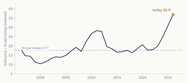
| Year | Gold price | Global broad money | Ratio |
|---|---|---|---|
| 1995 | $387 | $19.9tn | 19.4 |
| 2000 | $271 | $26.1tn | 10.4 |
| 2011 | $1,640 | $58.1tn | 28.2 |
| 2015 | $1,076 | $64.9tn | 16.6 |
| 2020 | $1,858 | $90.0tn | 20.6 |
| 2024 | $2,648 | $105.7tn | 25.1 |
| Today | $4,656 | $119.2tn | 39.1 |
Apply the historical growth rate of money, take off the cost of holding it, and let the ratio drift part way back towards normal, and you get about 3.33 percent a year over ten years. The range runs from minus 1.34 percent if it fully reverts to 5.76 percent if it does not revert at all. The middle case pays about twenty basis points more than cash, for 16.7 percent volatility.
For the fuller argument on gold’s role in a fragmenting monetary order, the desk’s earlier piece Gold, the dollar, and bitcoin treats it at length.
Bitcoin
Everything above has been measured against the same thing: the world’s money supply. That is the only honest way to price an asset with no cash flow, and it makes the real question obvious. What holds its value while the amount of money grows?
Broad money in the five largest blocs has grown at 6.16 percent a year for twenty years. That is not a projection. It is the measured rate at which the unit of account has been losing purchasing power.
| Supply growth | Can it respond to price? | |
|---|---|---|
| Broad money | 6.16% a year | It is a policy decision |
| Gold | about 1.7% a year | Yes. High prices fund new mines |
| Bitcoin | 0.82%, falling to 0.41% in 2028 | No. Fixed by the protocol |
Gold has been the traditional answer to money printing and it has worked, which is exactly why it is now at the top of its range. But gold supply is elastic. A high price funds marginal production and the above-ground stock grows.
Bitcoin is the only one on that list whose supply cannot respond to its own price. No amount of demand creates more of it, and the issuance rate halves again in 2028.
Gold above ground is worth about 32.4 trillion dollars, roughly 27 percent of global broad money. Bitcoin is worth 1.58 trillion, about 1.3 percent. That is not a price target. It says where each one is in a process. Gold finished becoming money centuries ago, which is why its ratio has sat in a range for decades and why you can value it at all. Bitcoin’s ratio has grown 63 percent a year for a decade, and four fifths of that is explained by time passing.
Figure 8. Gold and Bitcoin against the same denominator, log scale. Gold’s ratio is flat over thirty years. Bitcoin’s has grown 63 percent a year.
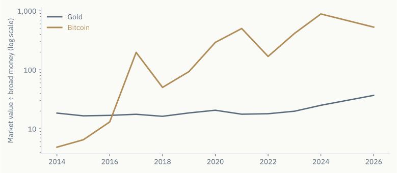
| Year | Gold ratio | Bitcoin ratio |
|---|---|---|
| 2014 | 18.5 | 4.9 |
| 2017 | 17.6 | 197.3 |
| 2020 | 20.6 | 291.9 |
| 2022 | 18.0 | 168.6 |
| 2024 | 25.1 | 884.7 |
| 2026 | 39.1 | 659.5 |
We are not saying Bitcoin is cheap. The model that works on gold does not work here, and the reason is not that Bitcoin is too young. It is that the model needs a level to revert to, and Bitcoin does not have one yet. Gold’s ratio to money has drifted 1.4 percent a year over thirty years, which is close to flat. That is what makes its median meaningful and what lets you say today’s reading is twice normal. Bitcoin’s ratio has grown 63 percent a year, and four fifths of the movement is explained by time alone. A median of a series like that is not a fair value. It is the midpoint of a journey that is still going. Running the model anyway produces a number, and the number would be meaningless.
Three things we can say.
Something else sets its price. While US shares hit their 99th percentile, gold its 100th and credit spreads squeezed to near record tights, Bitcoin fell 36.4 percent from its October 2025 high. Whatever lifted everything else at once is clearly not what is moving this. That is the property the rest of the portfolio is missing.
It is the only large asset not at an extreme. Everything in the first half of this piece sits between the 83rd and 99th percentile of its own history, and gold at the 100th. Bitcoin is 36.4 percent below its high.
It works where bonds may not. The next section describes two ways this can end. In one, government bonds do their job. In the other they do not, and gold enters that scenario at its most expensive level ever.
How the trouble arrives
The government bonds most portfolios hold against equity risk only work in one of the two ways this can plausibly end. What follows from that is an allocation question, not a forecast.
Bonds might not save you
You might read all this and conclude the answer is long-dated government bonds. That depends on how the trouble arrives.
If it is deflationary, spending stops, unemployment rises, spreads widen and inflation expectations fall. Bonds do what they are supposed to do and long duration is the best thing you own. That is 2008 and March 2020.
If it is inflationary, the rescue arrives into a country already carrying federal debt of 122.6 percent of output and running a 5.8 percent deficit at full employment. Short rates fall while long yields rise, because the term premium does the work instead of the policy rate. That is 2022, and Britain in September of that year, when a fiscal shock forced the Bank of England into the gilt market to stop pension funds failing.
| Deflationary | Inflationary | |
|---|---|---|
| What happens | Spending stops | Policy responds into 122.6% debt to GDP |
| Inflation expectations | Fall | Rise |
| Short rates | Fall | Fall |
| Long yields | Fall | Rise |
| Long bonds | Work | Fail |
| Last seen | 2008, March 2020 | 2022, UK gilts |
Which one you get depends on whether the shock is deflationary enough to absorb the fiscal response it causes. The starting point is not comforting. The US ten-year term premium is 0.83 percent, near its long-run average, which is not much compensation for fiscal risk. Japan is where this bites first, with a ten-year yield at the 78th percentile of its own history and the heaviest debt load in the developed world. Japanese institutions own a lot of foreign bonds, so if yields rise at home, that capital comes back and lifts yields elsewhere.
In the first case a balanced portfolio works. In the second, shares and bonds fall together, as they did in 2022.
What we would do
None of this is a forecast and none of it is a reason to sell. Valuation has been a poor timing tool for a decade and there is no reason to think it has improved. Markets at the 99th percentile have gone to the 100th before.
What the numbers do support is a statement about the shape of the risk. You are being paid close to nothing to own the standard portfolio, at a moment when real rates are near their highest of the century. Those assets are all expensive at the same time, which means they are responding to the same thing and will fall together whatever the labels say. The debt behind the largest companies in the index is around three times what their balance sheets show, and it runs through insurers and private credit in ways nobody has tested. And the thing most portfolios hold to offset share risk only works in one of the two ways this can end.
A portfolio built from assets that are all expensive for the same reason is much less diversified than the allocation table suggests. Moving between expensive things is not diversification.
Adding more of them does not help, which is the sense in which there is nowhere left to hide. What helps is owning something whose price is not set by the same forces.
That is the case for holding some Bitcoin, and it does not depend on Bitcoin being cheap. It rests on supply growing at 0.82 percent a year against money growing at 6.16 percent, on supply that cannot increase however high the price goes, on a market value one twentieth of gold’s, and on a price that fell by more than a third while everything else hit a record.
Size it properly. None of this argues for a large position, and the volatility argues against one. At five percent of a portfolio, a halving costs you two and a half percent. That is a bad quarter, not a bad decade. And five percent of something at one percent of global money still moves the needle if any of that gap closes. The argument is not for conviction. It is for a position big enough to matter and small enough to be wrong about. How the position is held matters as much as its size, and the desk’s companion piece How to hold Bitcoin treats custody as the first-order question it is.
Onramp MENA intends to apply for a licence to provide Bitcoin custody in Bahrain, so this is the conclusion you would expect from us. Every number above comes from public data and can be checked. We would rather be judged on whether they hold up.
Appendix: the working
On buybacks. The excess CAPE yield uses earnings rather than dividends, so the shift to buybacks does not affect it directly. Indirectly it does. Buybacks cut the share count, so earnings per share grow faster than total earnings, and a ratio built on ten years of per-share earnings sits higher than it would have in a dividend era. Shiller’s total-return CAPE corrects for this. Today reads 0.09 percent on the standard measure, at the 7th percentile of its own history, and minus 0.09 percent on the corrected one, at the 16th. Both are in the bottom fifth of 144 years. The size of that correction has fallen rather than risen, averaging 29 percent in the early twentieth century against 9 percent over the past decade, because it works through dividends available to reinvest and there are fewer of those now.
On the comparison itself. An earnings yield and a bond yield are not the same kind of claim. A coupon is contractual and earnings can grow. A low premium only matters if you assume no real earnings growth, and the case for AI is that growth will be exceptional. The defence of the measure is that it kept working across 144 years in which earnings did grow, so the optimistic case needs today to be different from every previous period. That is a reasonable thing to believe. It is not something this measurement can settle and we do not claim it can.
On testing the gold model. How far gold’s ratio sits from its median predicts the next ten years of returns with a correlation of minus 0.54 across 34 independent windows, using only data available at the time. At five years it weakens to minus 0.21, so this is a long-horizon tool. Gold’s ratio has drifted 1.4 percent a year over thirty years with an R squared of 0.24, close to no trend, which is what makes a median meaningful. Bitcoin’s has drifted 63 percent a year with an R squared of 0.82. The forward-return test cannot be run on Bitcoin at all. It needs a ten-year forward window and enough prior history to form a median at the start of it. Gold supplies 34 such windows. Bitcoin has existed since January 2009, and our price series begins in September 2014 where continuous daily quotes start, but even counting from the beginning there would be only a handful of windows, and the medians would be formed during a period when the price rose by several orders of magnitude. The constraint is the shape of the series rather than the number of years in it.
One caveat. This model said gold was expensive in every year of the past decade, and gold rose a lot. Something that has been early for ten years can be early again.
References
- Robert Shiller’s dataset, for CAPE and the excess CAPE yield.
- Barclays and Shiller, for international CAPE.
- MSCI index factsheets, 31 July 2026, for index constituents and concentration.
- Federal Reserve Economic Data, for yields, financial conditions and fiscal figures.
- World Bank, European Central Bank and national sources, for broad money.
- Bank for International Settlements, Quarterly Review, 16 March 2026.
- Wall Street Journal analysis of company filings, 16 August 2026.
Frequently asked questions
Is there anywhere left to hide for an allocator right now?
Almost every standard destination is expensive at once. US large caps sit at the 99th percentile of their own valuation history, every major regional index a large institution is likely to own is high against its own past, gold is at twice its normal relationship to the world's money, and long government bonds only hedge one of the two ways the cycle can plausibly end. The one large asset not at an extreme of its own history is Bitcoin, which is roughly 36 percent below its October 2025 high.
Are stocks overvalued everywhere or only in the US?
Nearly everywhere that is investable at size. The US is at its 99th percentile, but Asia ex Japan is at its 94th, developed markets at their 92nd and emerging markets at their 91st. The genuinely cheap markets are structurally thin: MSCI Colombia holds three companies, the Philippines and Chile ten each, and their trackers trade a few million dollars a day. The cheapness is arithmetically real and close to useless in an institutional portfolio.
Is gold overvalued in 2026?
Measured against the broad money supply of the five largest monetary blocs, gold is at 39.1 against a thirty-year median of 17.7, which is twice its normal relationship to money and the highest reading in thirty years of data. A mean-reversion model built on that ratio points to roughly 3.3 percent a year over ten years in the middle case, about twenty basis points over cash. The same model has said gold was expensive for a decade while it rose, so it is a long-horizon tool rather than a timing signal.
Why does Bitcoin matter here when it is down almost 50 percent?
Because its price is demonstrably not being set by whatever set the price of everything else. While US shares reached their 99th percentile, gold its 100th, and credit spreads their tightest, Bitcoin fell 36.4 percent from its October 2025 high. It is also the only asset in the comparison whose supply cannot respond to its own price: issuance is fixed at 0.82 percent a year, falling to 0.41 percent in 2028, against broad money growing at 6.16 percent a year. None of that makes it cheap. It makes it differently priced.
How should an institution hold Bitcoin if it allocates?
Sizing comes first: at five percent of a portfolio, a halving in price costs two and a half points, a bad quarter rather than a bad decade. Custody comes second, because Bitcoin is a bearer asset and the position is only as durable as the arrangement holding it. The research desk's companion piece, How to hold Bitcoin, scores the exposure vehicles and custody models on one rubric and explains why multi-institution custody is the fiduciary default.
There is nowhere left to hide
Leave your email and the download starts right away. New research from the desk will reach the same inbox.
Unsubscribe anytime. Handled per the privacy notice.
This article is published as research and analysis. It does not constitute legal, regulatory, financial, or investment advice and should not be relied upon in connection with any specific transaction or licensing strategy. Readers should seek their own qualified counsel. Where specific products, providers or jurisdictions are named, they are referenced factually on the basis of public information, for analysis, and not as endorsements.